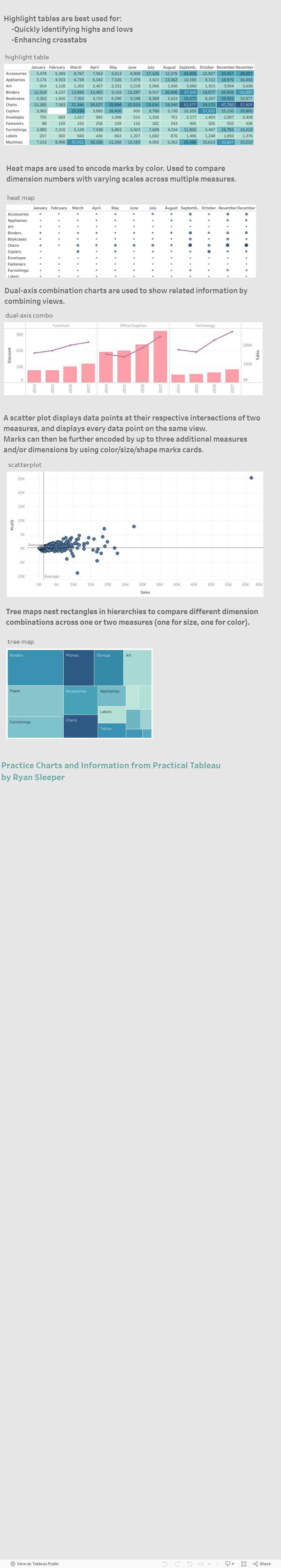
To analyze your data, you should be in a worksheet which you can access by clicking the orange Sheet 1 (default name) tab on the bottom of the page.

Once you are in a worksheet, on the left side you can see your data, its dimensions, and measures. You can drag/drop the field you want to analyze into the Rows and Columns spaces at the top of the work sheet. You can also double-click the fields.
Tableau offers more help on beginning data visualizations here. 
On the right side, you can see different visualization options under "Show Me". The ones Tableau understands how to apply to your data will be highlighted. If some visualization options are grayed out then additional parameters should be provided which you can see when you hover above the option. Drag the missing parameter to the sheet to make the visualization available.